Accessibility
Integrating new accessibility standards to create a more inclusive trading experience
Scope
With the introduction of the European Accessibility Act (EAA) and its implementation through Germany’s Accessibility Strengthening Act (BFSG), this work focused on improving the flatex next platform to meet the digital accessibility requirements effective from 28 June 2025.
With an estimated 1.3 billion people globally (one in six people) experiencing significant disability, accessibility is both a legal requirement and an opportunity to create more inclusive digital experiences that benefit everyone in the end.
The work involved evaluating the current platform for accessibility, identifying barriers, defining strategic recommendations for enrollment, design UX/UI proposals and reviewing implementation.
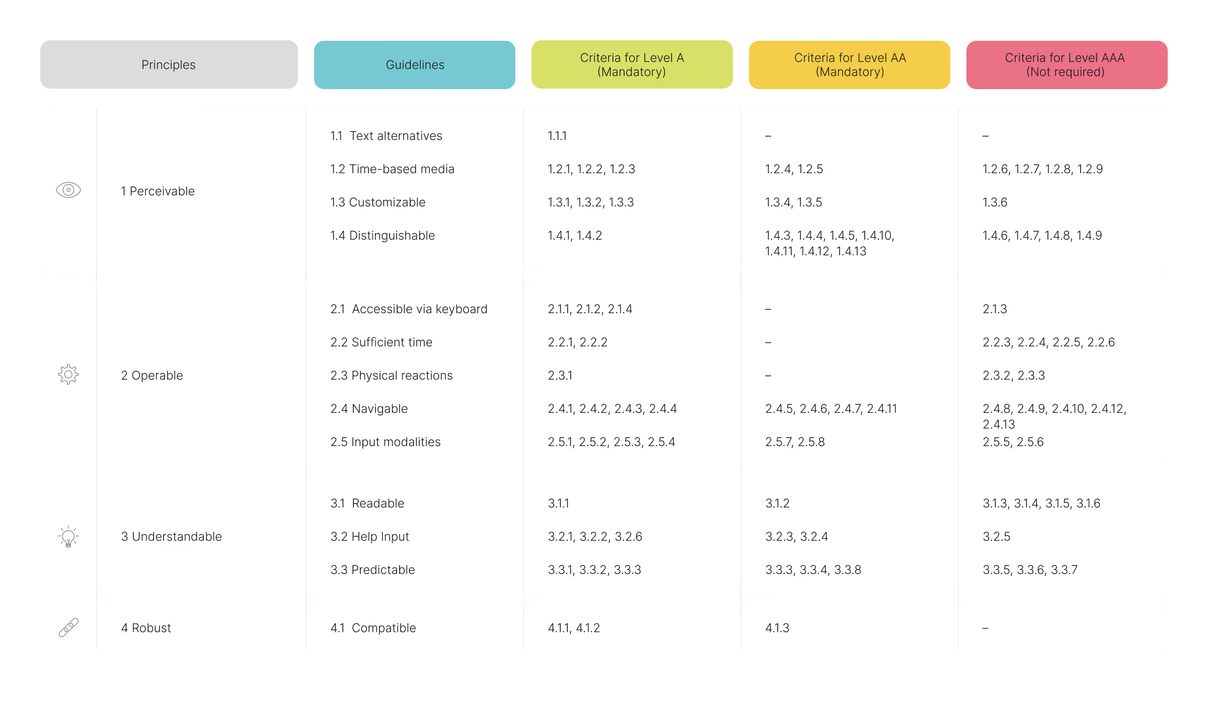
WCAG 2.2 Digital Accessibility Requirements Overview
Process
Research & Analysis
Research & Analysis
To establish a solid foundation, I immersed myself in digital accessibility principles and guidelines, building the knowledge needed to apply them across the platform. I also briefed the entire team on accessibility best practices and presented strategies for putting them into practice.
The key challenge was the lack of established accessibility examples or best practices in trading and fintech. This meant evaluating and developing tailored solutions to address specific accessibility requirements within this domain.
The key challenge was the lack of established accessibility examples or best practices in trading and fintech. This meant evaluating and developing tailored solutions to address specific accessibility requirements within this domain.


Process
Research & Analysis
Research & Analysis
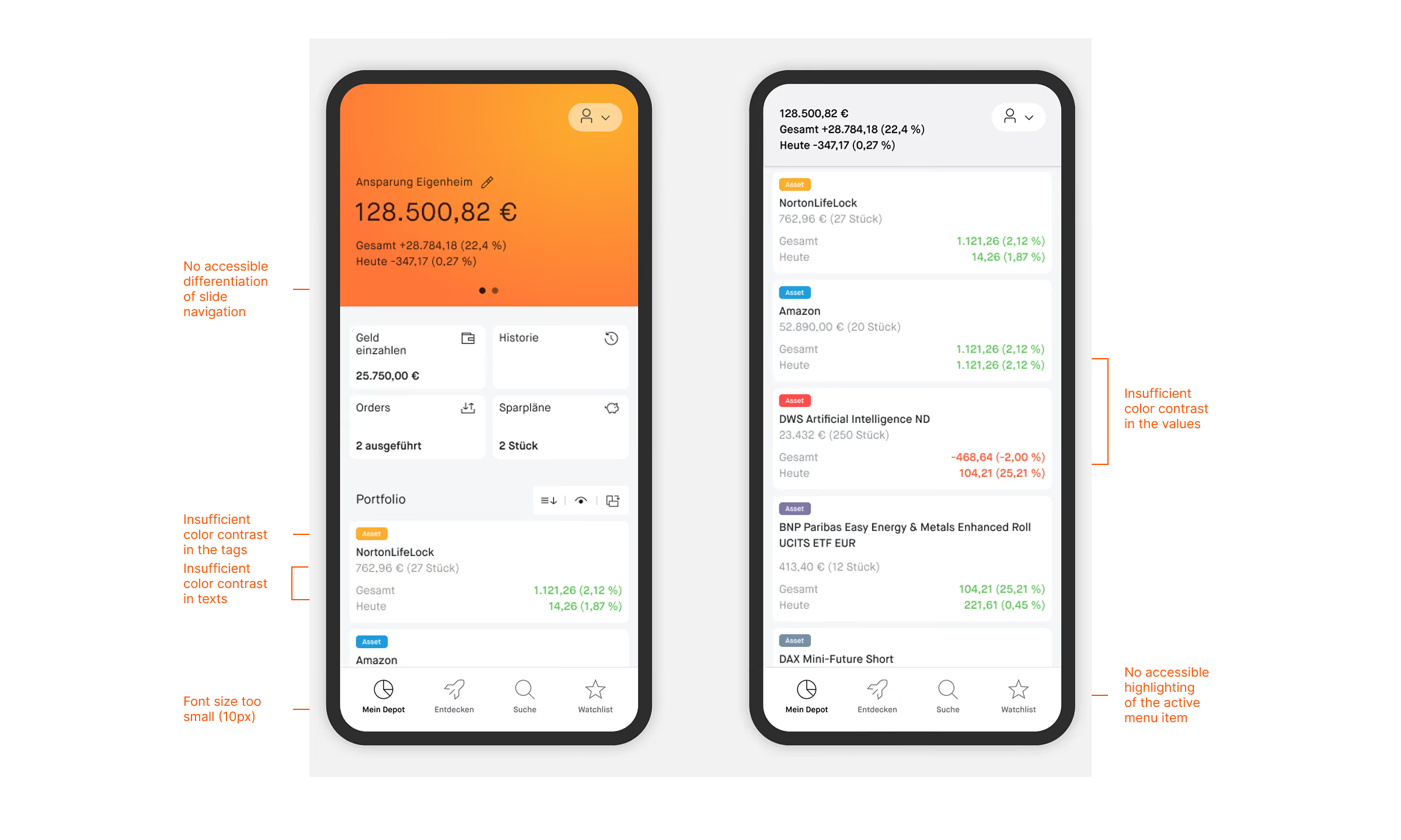
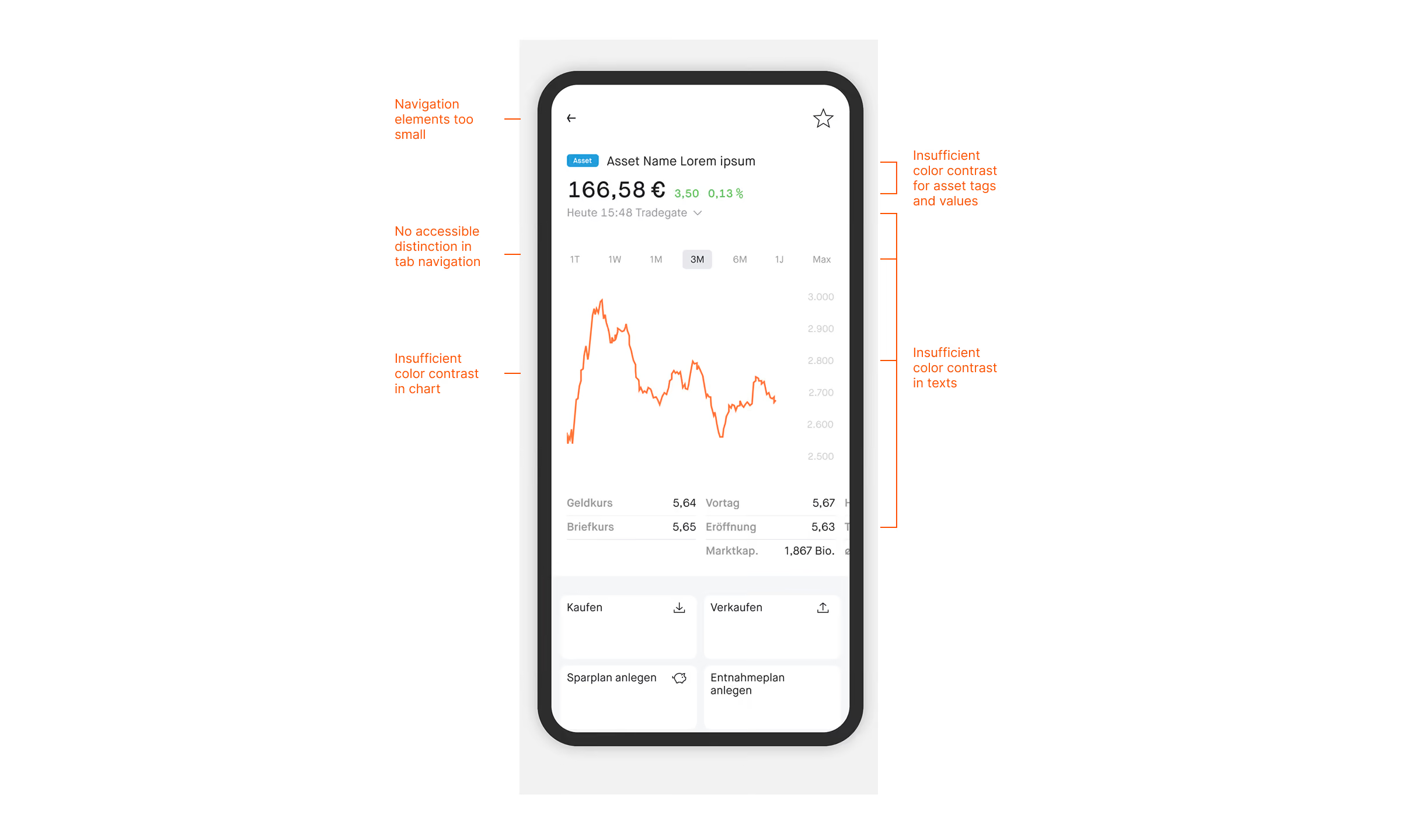
After evaluating the current state of the whole platform regarding accessibility I concluded that in addition to typography, color and contrast adjustments and adapting basic interface elements serve as the most fundamental building blocks—and thus the starting points—for all further accessibility optimizations.
Color Evaluation – Light Mode

Color Evaluation – Dark Mode

Process
Research & Analysis
Research & Analysis
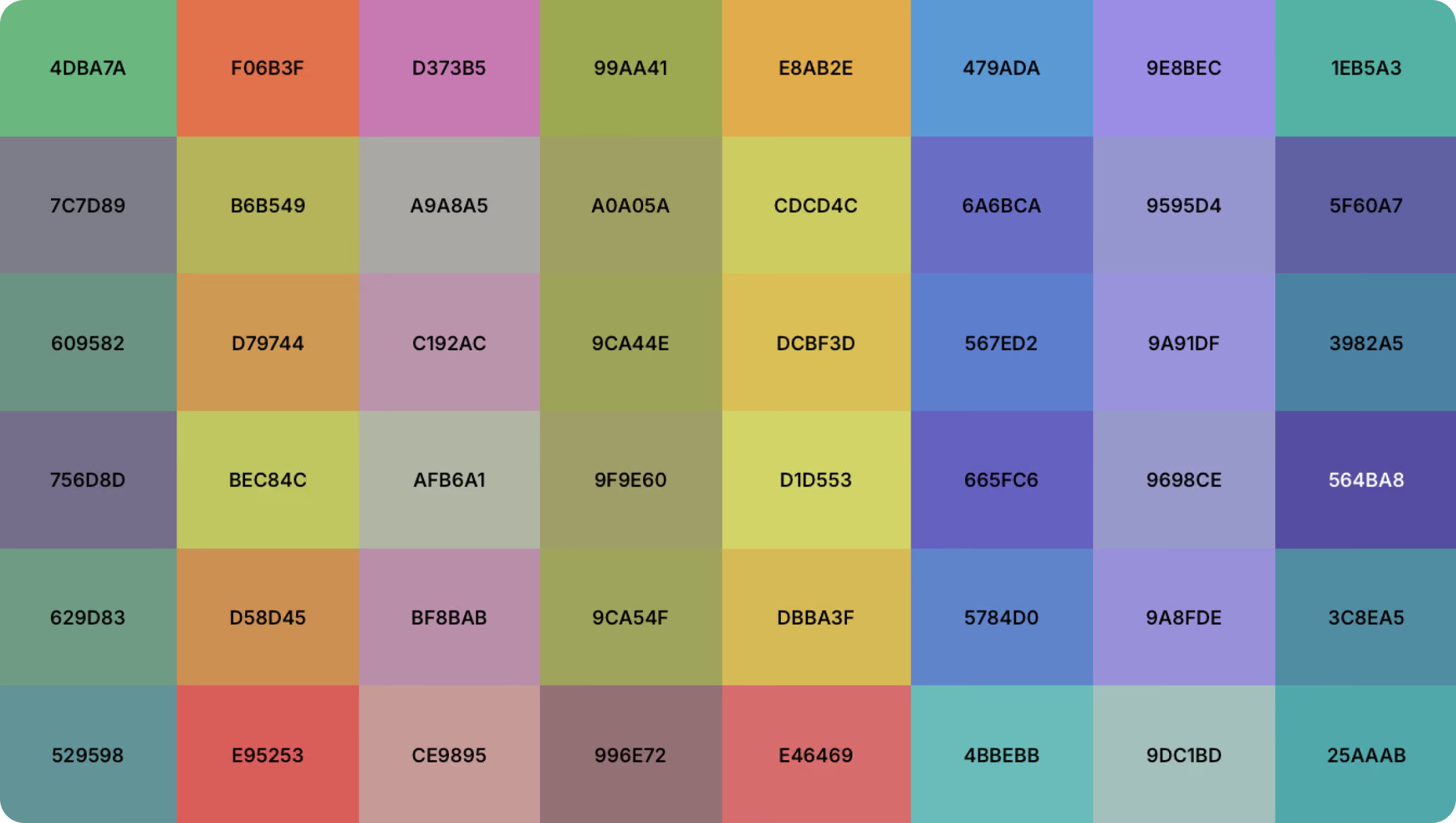
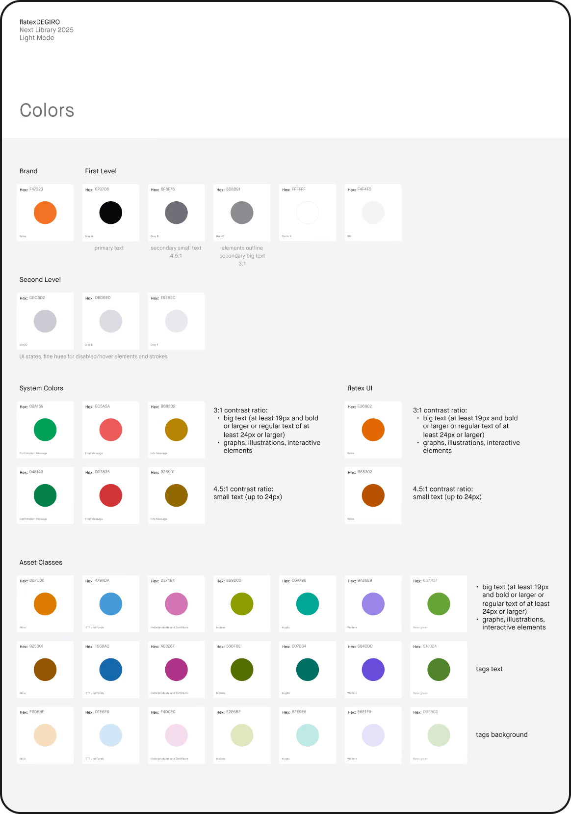
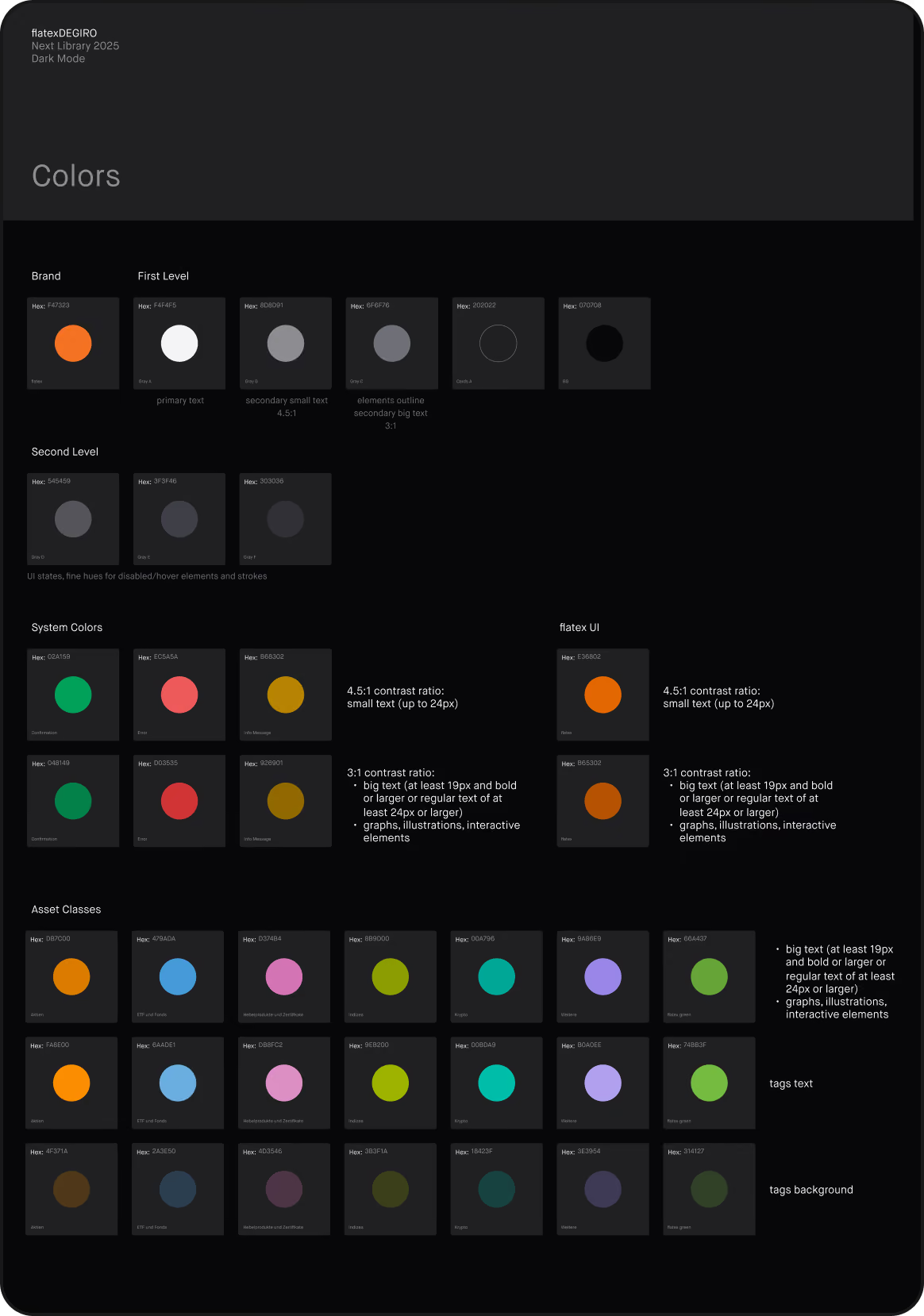
I evaluated the accessibility of the existing color palette using various contrast-checking tools. As expected, the color library needed overall improvements to meet accessibility standards. Some shades of gray can no longer be used, whereas others can be optimized.
The biggest challenge was optimizing the vibrant accent colors—especially orange, the primary brand color—and the asset-class colors. In light mode, meeting contrast requirements significantly limited the available color options.
The biggest challenge was optimizing the vibrant accent colors—especially orange, the primary brand color—and the asset-class colors. In light mode, meeting contrast requirements significantly limited the available color options.
Font Evaluation (Maison Neue)

Process
Research & Analysis
Research & Analysis
Alongside the color evaluation, I assessed the existing typeface for accessibility. While it provided a solid foundation for readability, some characters were difficult to distinguish, and narrow apertures reduced legibility. To address these issues, we recommended an alternative typeface better suited to accessibility needs.
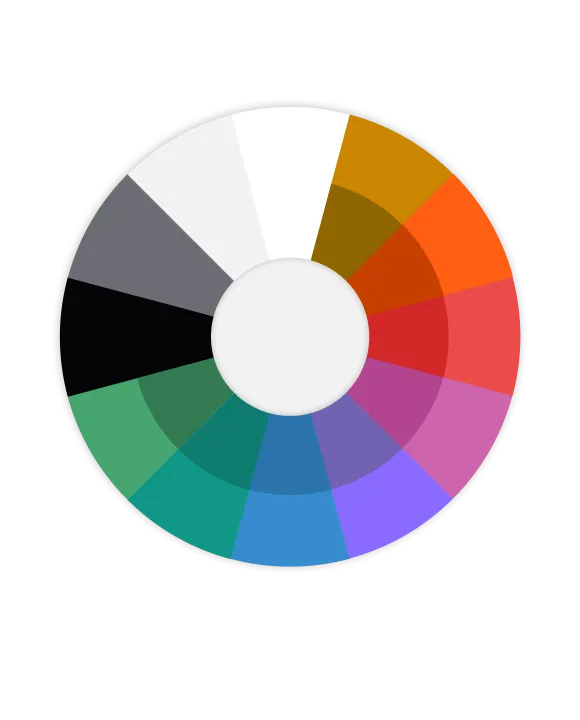
New Color Spectrum – Dark Mode

New Color Spectrum – Light Mode


Process
Iterate & Define
Iterate & Define
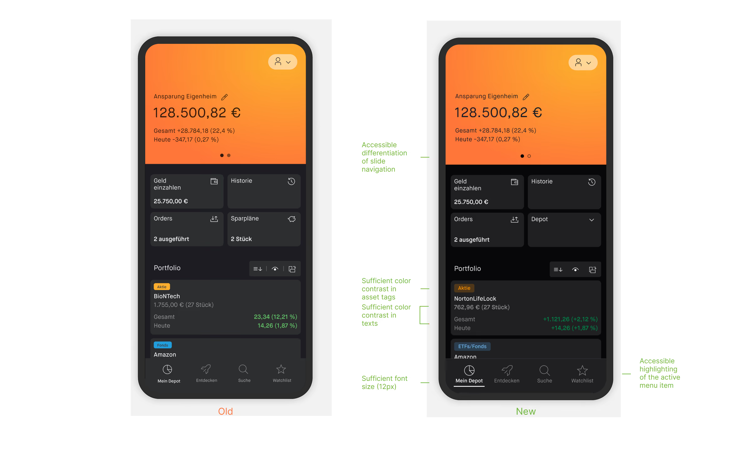
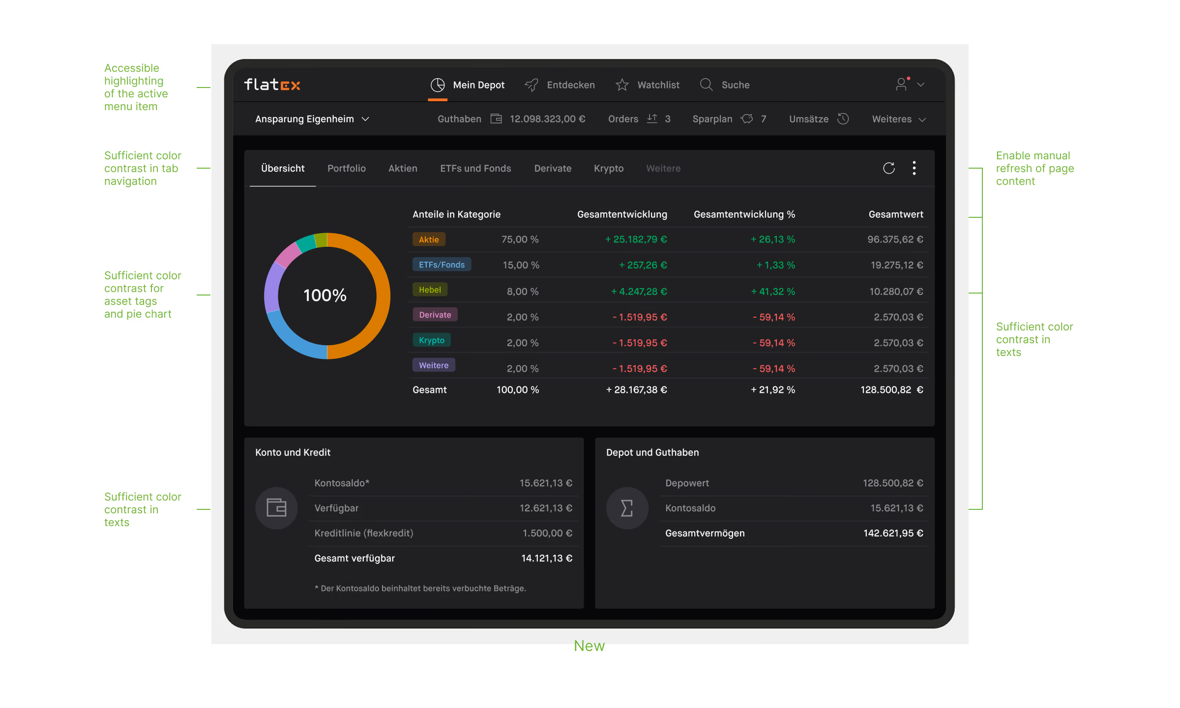
Based on my analysis and WCAG guidelines, I developed a new color library, iteratively refining and harmonizing the palette across light and dark modes. I validated the colors using various testing methods and contrast-checking tools.
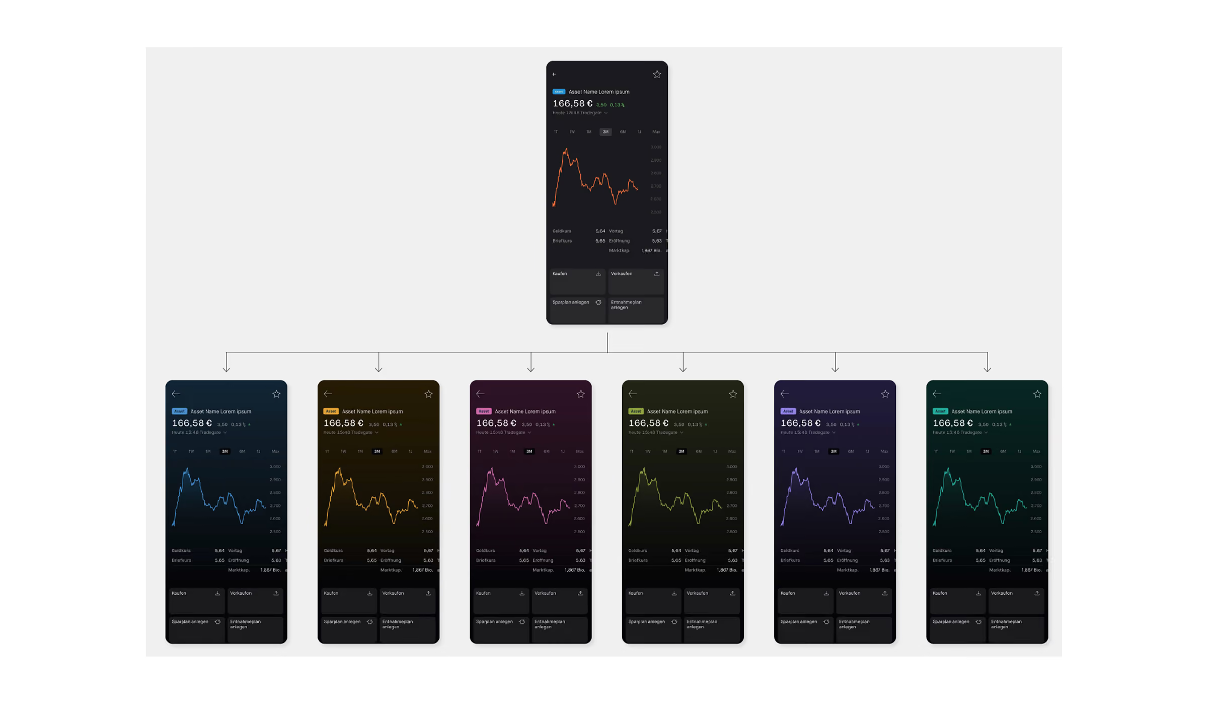
To ensure the library worked reliably in practice, I also tested the full range of tones in context across selected key screen templates, verifying their suitability for the platform’s different use cases.
To ensure the library worked reliably in practice, I also tested the full range of tones in context across selected key screen templates, verifying their suitability for the platform’s different use cases.
Solution
Define & Rollout
Define & Rollout
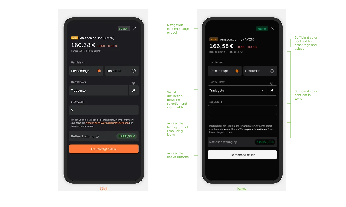
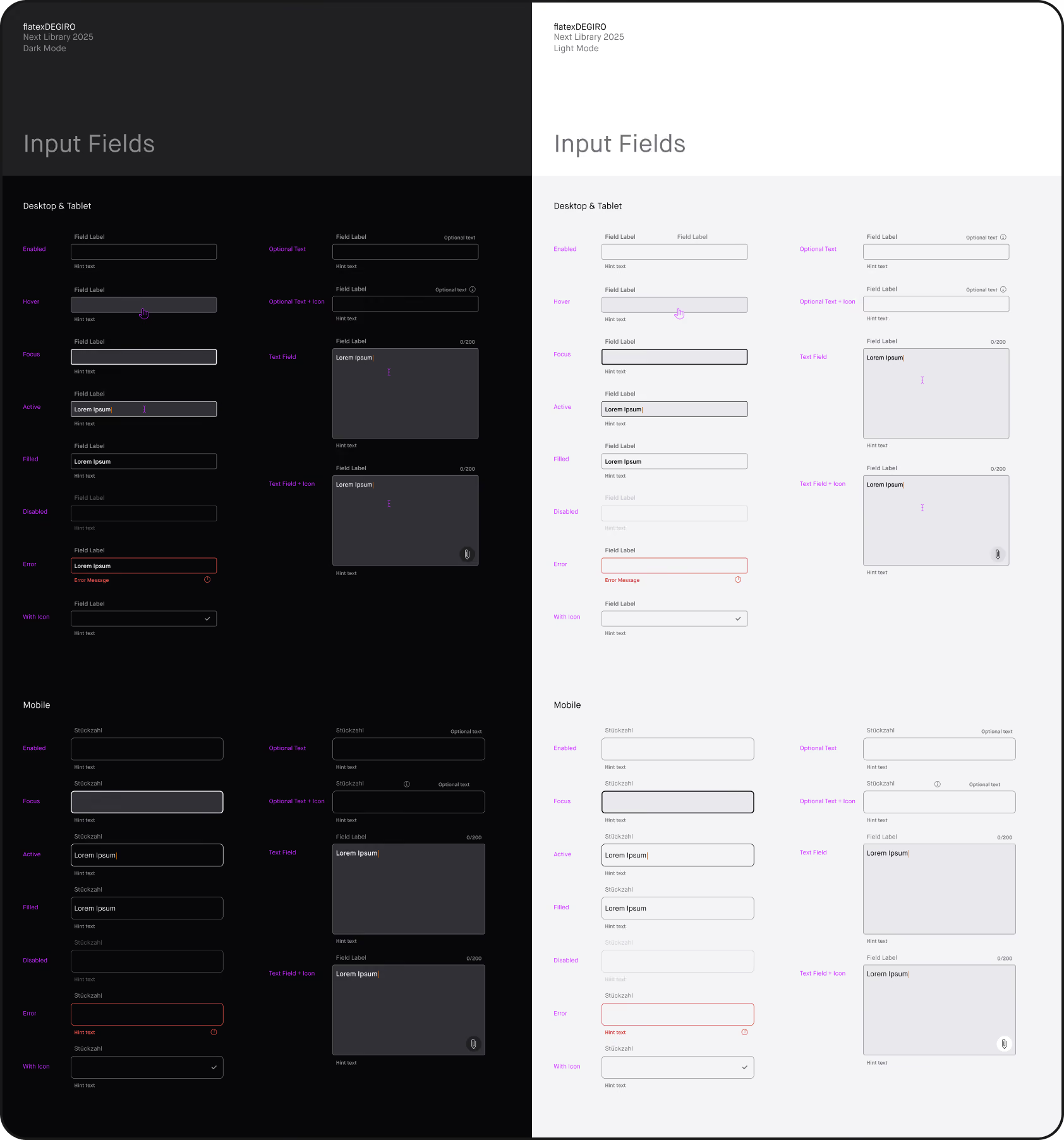
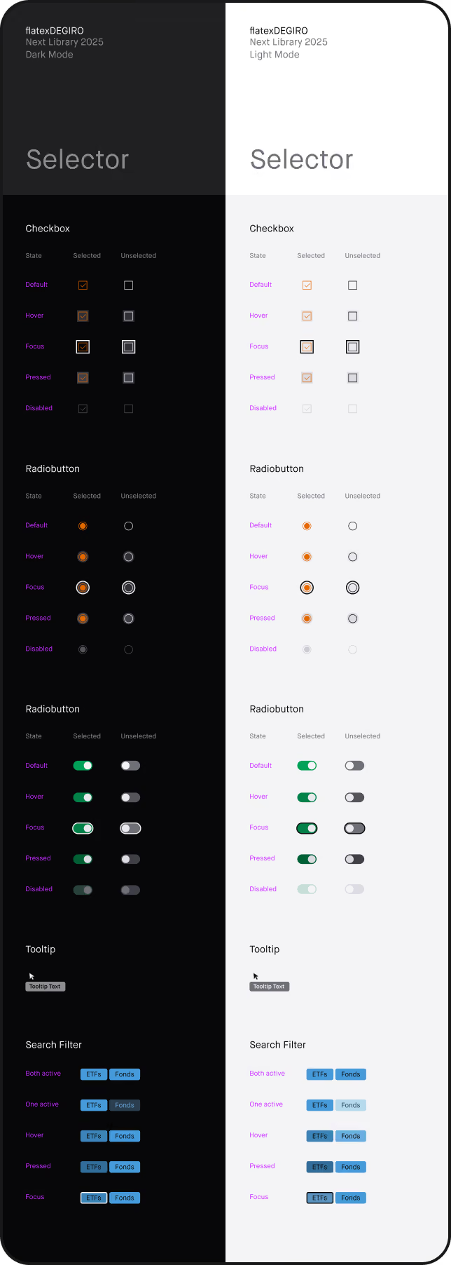
After aligning with the team and securing approval for the new color palette and related interface adjustments, I updated all screen templates and the design library accordingly. The changes were then implemented incrementally in the live environment.
Conclusion
Learnings & Impact
Learnings & Impact
Accessibility goes beyond meeting guidelines—it requires testing design decisions in context and balancing usability with visual identity. The project also highlighted the importance of tailored solutions in fintech and of involving the team early to embed accessibility into the design process.
ETF Journey
Redesigning a streamlined Trading Storyline Around a New Product

Scope
Integrating a new ETF product into the trading platform became an opportunity to rethink the entire user journey — from discovering and understanding the product to evaluating, trading, and managing it.
The scope went beyond adding new ETF-specific features. We restructured the experience across the platform and designed a coherent flow concept of new and existing touchpoints, tools, and interactions. The goal was to create a more engaging, intuitive, and streamlined journey for ETF investing from first interaction to trade and beyond.
The work began with service design approaches like broad field research, touchpoint evaluation, information architecture, user flows to classic UX/UI design for feature concepts.
WCAG 2.2 Digital Accessibility Requirements Overview
Process
Research & Analysis
Research & Analysis
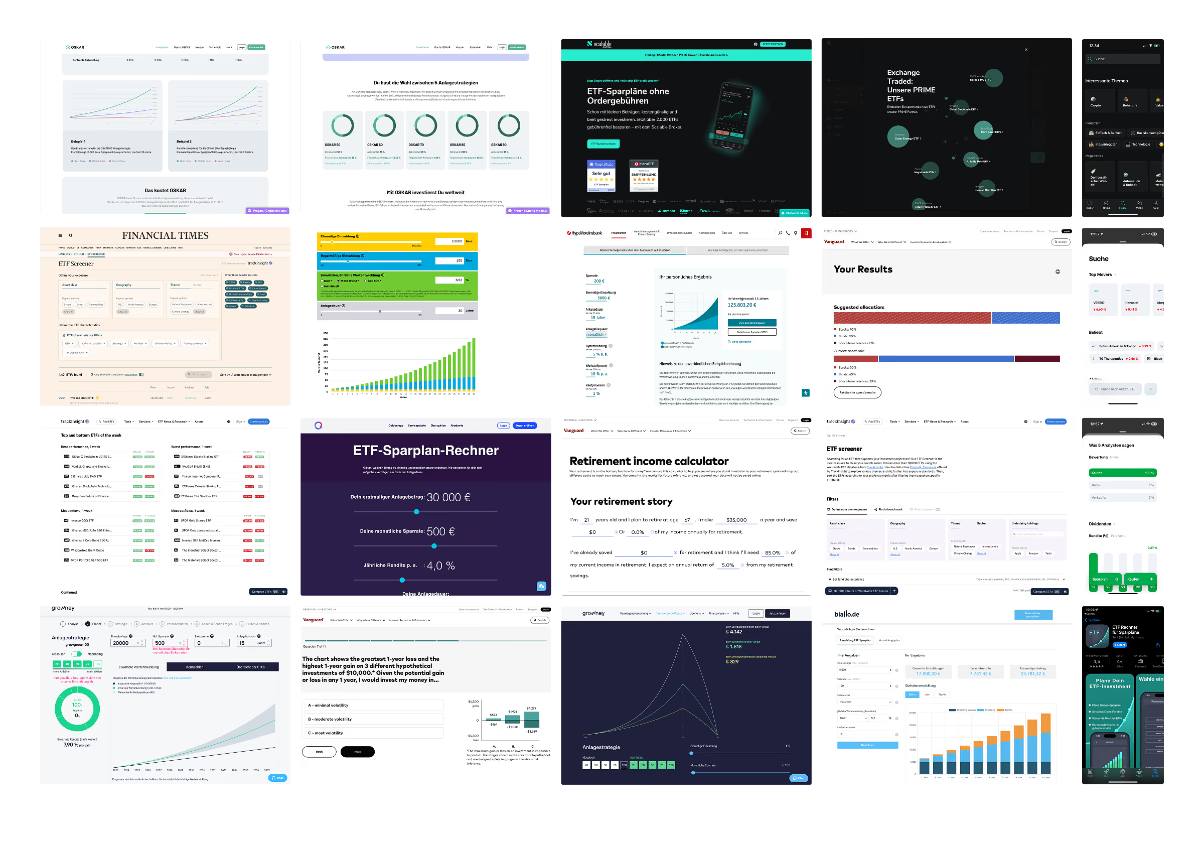
To define the future ETF experience, we explored the broader investment landscape, analyzed competitor approaches, and identified emerging UX patterns and best practices across financial platforms and beyond.
The research focused on understanding how leading products simplify complex investment decisions, communicate financial information in an engaging way, and guide users through the journey from discovery to action. We uncovered innovative opportunities for possible features and tools for ETFs and saving plans like questionnaires with product recommendations, product search/explore, calculators, simulators and forecast visualizations.
The research focused on understanding how leading products simplify complex investment decisions, communicate financial information in an engaging way, and guide users through the journey from discovery to action. We uncovered innovative opportunities for possible features and tools for ETFs and saving plans like questionnaires with product recommendations, product search/explore, calculators, simulators and forecast visualizations.


Process
Research & Analysis
Research & Analysis
The existing ETF consumer experience was analyzed to identify obstacles and barriers and to understand how the ETF product could be integrated seamlessly into the current ecosystem. We examined key entry points, user flows, and the overall product structure to identify opportunities and potential improvements.
This analysis provided the foundation for defining where and how ETF-related features could be introduced while ensuring a coherent and intuitive experience across the platform.
This analysis provided the foundation for defining where and how ETF-related features could be introduced while ensuring a coherent and intuitive experience across the platform.
WCAG 2.2 Digital Accessibility Requirements Overview
WCAG 2.2 Digital Accessibility Requirements Overview
Process
Concept
Concept
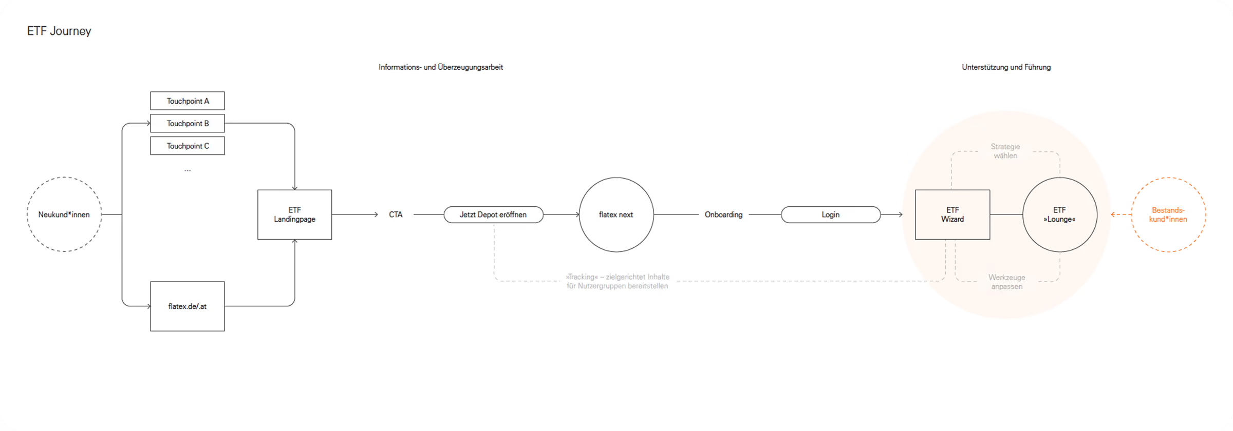
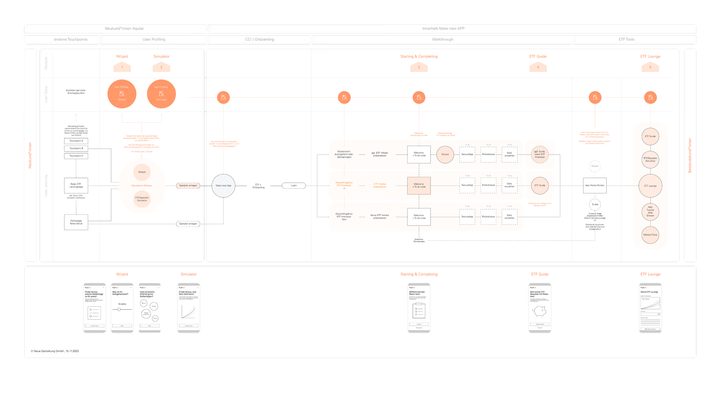
Based on the research insights, we developed a structured customer journey for the whole ETF experience in close collaboration with development and product management.
This process started with a low-fidelity journey concept to define the overall flow, key interactions, and strategic touchpoints. This foundation was then refined into a more detailed experience map, incorporating early concept ideas and wireframes for ETF-specific tools and features like a Wizard for product exploration and a Simulator for ETF/saving plans, a to-do list for starting trading, a step-by-step ETF guide and a separate ETF area with helpful information and overview.
This process started with a low-fidelity journey concept to define the overall flow, key interactions, and strategic touchpoints. This foundation was then refined into a more detailed experience map, incorporating early concept ideas and wireframes for ETF-specific tools and features like a Wizard for product exploration and a Simulator for ETF/saving plans, a to-do list for starting trading, a step-by-step ETF guide and a separate ETF area with helpful information and overview.
Process
Iterate & Define
Iterate & Define
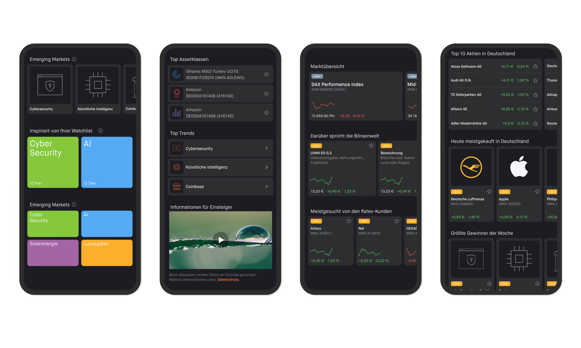
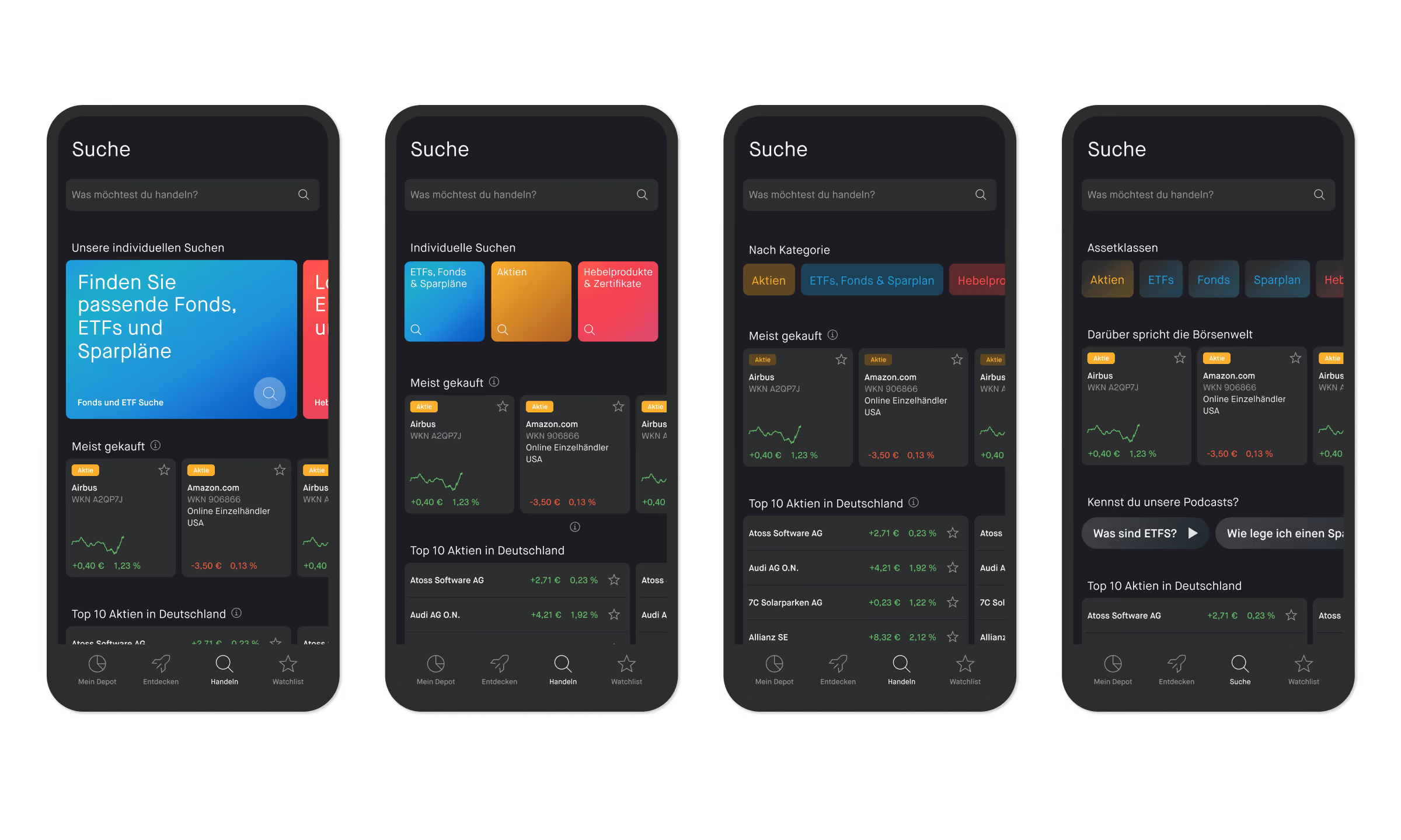
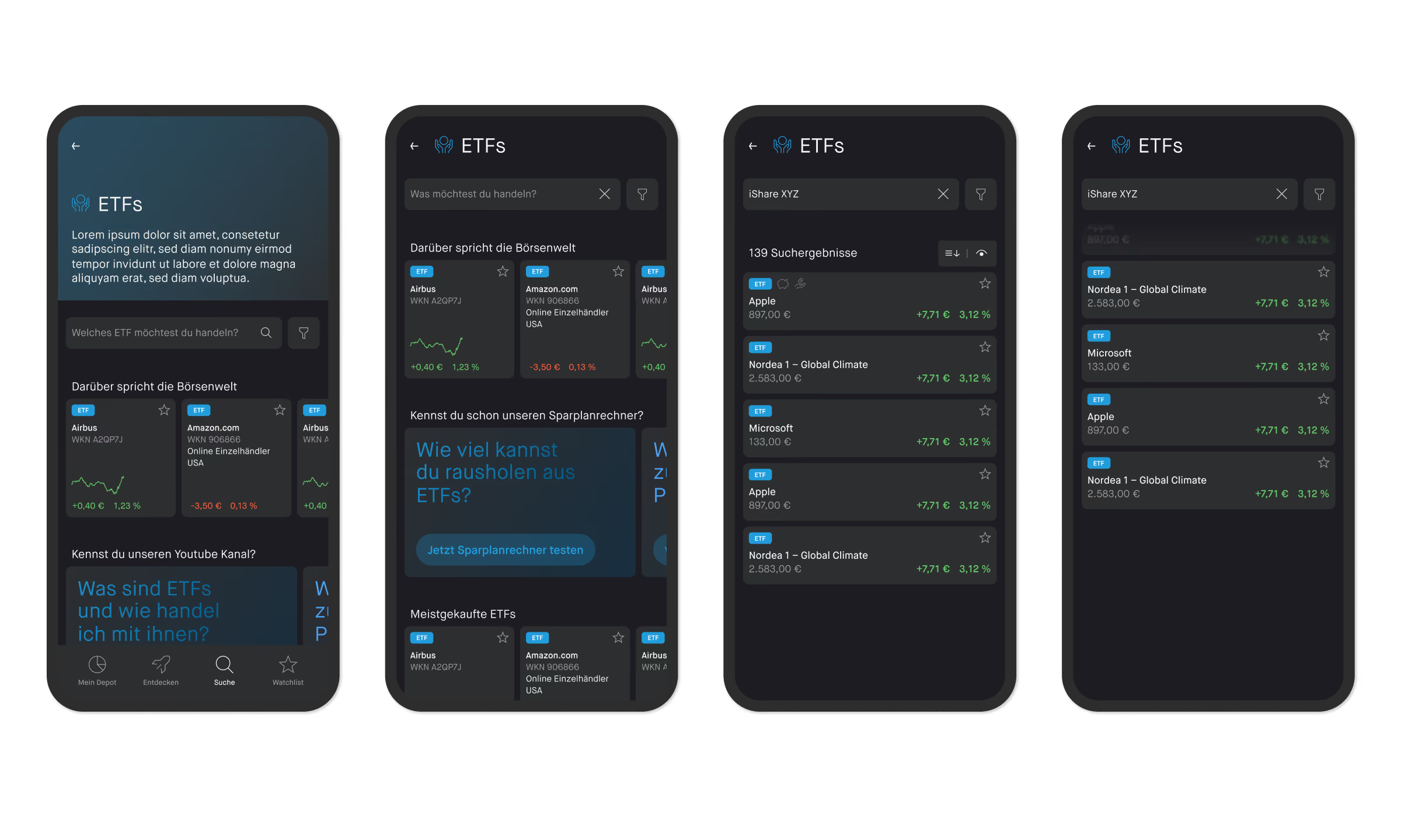
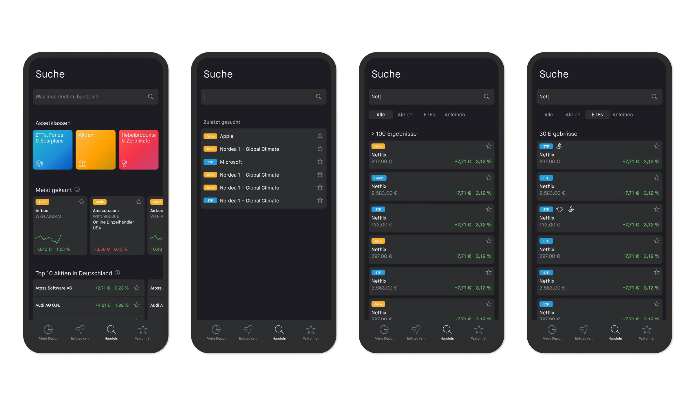
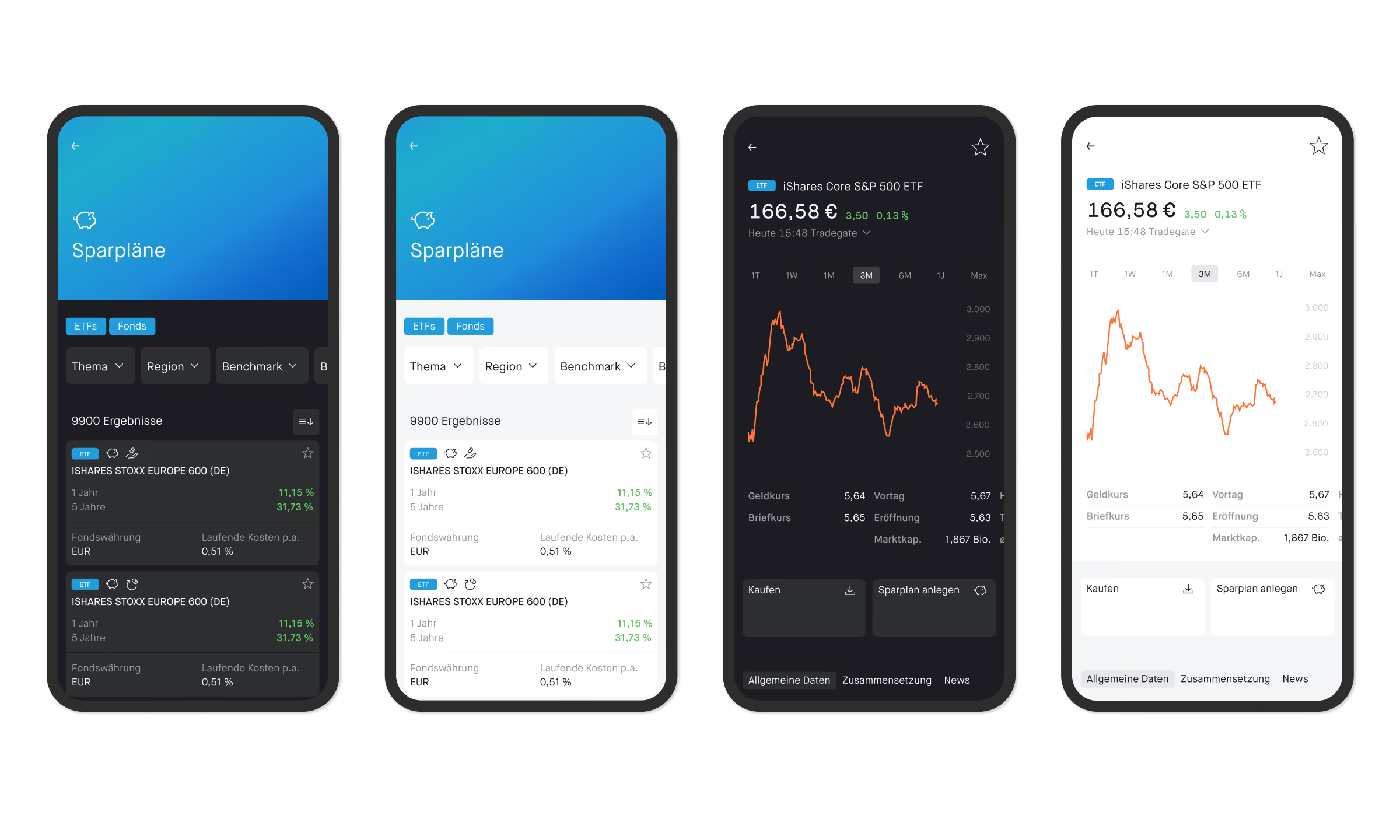
Following the evaluation and alignment of the new storyline with the executive board and management, the concept was gradually translated into the existing app experience.The first phase focused on establishing the core functionality required for ETF trading. This included UI concepts for integrating the new asset class across key areas of the platform, as well as the ETF search and single ETF product pages.
Solution
Define & Rollout
Define & Rollout
After alignment and iteration loops, the core ETF features were integrated into the app. We finalized the designs templates and worked closely with developers throughout implementation, refining interactions and details to ensure a consistent and seamless experience across the platform.
Conclusion
Learnings & Impact
Learnings & Impact
The introduction of a new ETF product became an opportunity to rethink the entire journey across key touchpoints, from product discovery and exploration to trading. By combining research, service design, and UX/UI design, we developed a holistic experience concept that seamlessly integrates ETF-specific features into the existing platform.